The
Psychology of Color
Understanding and using color to
create and send the right messages
By Martine Rothstein

Researchers in North America have, in fact, long studied the effects colors have on shopping habits and have found that different colors motivate different types of prospective purchasers. For example:
Impulse shoppers: It seems that your average impulse shopper responds best to red-orange, black, and royal blue.
Budget shoppers: Those who plan and stick to financial plans are known to respond best to pink, teal, light blue, and navy.
Conservative shoppers: These customers respond best to pastels including colors such as shades of pink and pale blue.

How an individual responds, however, may also be influenced by age, gender, and background, too. In fact, different cultures are predisposed by color in some incredibly different ways--for instance, yellow means jealousy to the French, but signifies sadness to the Greeks and is sacred to the Chinese.
Knowing how color and tone affect people--especially your customer and patient base--will help you decide what colors are right for your circumstances. Certainly, part of understanding the way the eye works relates to the properties of color--but let's review what you may or may not already know.
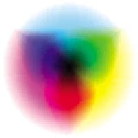
It goes back some three centuries, when Sir Isaac Newton discovered that by arranging the spectral colors into a color circle--known today as the color wheel--color mixing could be effectively explained. For the first time, the most important psychological aspects of color vision were both explained and given a name--complementary colors. These colors sit opposite each other on the color wheel, and because they are opposites, they tend to look especially lively when used together. This has created the psychological effects or feelings that colors evoke.
COLOR AS ITSELF
Color is made up of three components--hue, saturation, and brightness. All these components are needed in order to describe color.
|
|
|
|
Different colors motivate different types of prospective purchasers |
|
Hue: The component of color we are the most familiar with, it is the indicator of whether a color looks blue, green, red, yellow, etc.
Saturation: Characterizes how pure a color is. Any other color additives determine the level of saturation.
Brightness: Designates how strong the color appears. Logically, whites and yellows have strong brightness; browns and black have low brightness.
COLOR AS A GAUGE
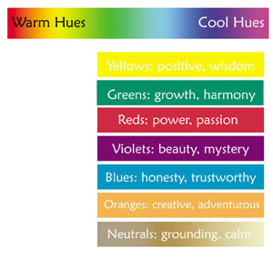
Lighter colors tend to be more active, and deeper colors tend to be passive. Tonal qualities classify colors into warm and cool categories.
Warm hues: Include reds, oranges, and yellows. They stimulate creativity and activity, creating a feeling of excitement as well as warmth.
Cool hues: Include blues, greens, and purples. Their passive and calming qualities evoke peace and tranquility.
In addition to the way colors make you feel, be aware that how you--and your customers--see your rainbow depends on light factors. Every light source has different spectral properties that will affect how the color is interpreted. When color appearance changes due to light, it is a phenomenon known as metamerism. This is why it is important to remember that when you are selecting a hue to use in your business, be sure to first view it under the lighting conditions where it will be used.
THE EFFECTS OF COLORS
The following list briefly describes the effects various colors have on the psyche:
Red: Excitement, strength, passion, speed, and danger
Blue: The most popular color, it connotes reliability, trust, and belonging
Yellow: Warmth, cheer, happiness, and positiveness
Orange: Playful, vibrant, and creative
Green: Growth, abundance, harmony, and health
Purple: Spiritual, royalty, and inspiration
Pink: Nurturing, security
White: Pure, clean, youthful, and mild
Black: Sophisticated, elegant, seductive, and mysterious
Gold: Prestige, expensive
Silver: Cold, scientific
Neutrals: Stability, grounding
So, whether you are looking to place an advertisement, change the color scheme in your practice, or encourage purchasing products through the way your customer sees and ultimately feels, color is key.
|
Speaking In Color |
Here are some of the terms most often used in discussions of color. Analogous: Colors that sit next to each other on the color wheel. Chroma: The intensity of color. Complementary: Colors that sit opposite each other on the color wheel. Hue: The actual color or position of color on the color wheel. Neutrals: White, black, grays, and any colors with a significant amount of gray. Shade: A dark value that has been affected by adding black or a darker color. Tint: Light values that are made by the addition of white or lighter color. Tone: Neutralizing colors by adding colorants that gray. Value: The lightness or darkness of a color. |


