Crafting
Your Website
A hands-on guide to Web
design and the resources to make it happen
By Joe Dysart
Now that the Web as a revolutionary communications tool has become a fait accompli, a number of businesses in the eyecare industry have discovered ways to elevate the medium to world-class heights, and create bustling centers of ecommerce.
Seasoned Web designers say that sites achieving this status realize that a Website is much more than a flag of the Net or a billboard in cyberspace. Instead, the best Websites create inviting, easy-to-use environments--they are an interactive tool where prospective and existing clients can learn about your business and begin to work with you.
The Website for your practice should not be a technological homage to yourself, your company, or the Web designer who helped you put the site together. Showy, forever-to-download sites look cool, but can impede ecommerce. The Webscape is littered with such sites--don't add yours to the heap.
|
|
|
|
Ladarvision makes a dramatic, graphic statement without slowing download times |
|
WORKING THE WEB
"Usability rules the Web," says Jakob Nielson, a principal in the Nielsen Norman Group, a Web design consultancy. "The Web is the ultimate customer-empowering environment. He or she who clicks the mouse gets to decide everything. It is so easy to go elsewhere; all the competitors in the world are but a mouse-click away."
In designing your own site, you'll need to start with a good Website authoring tool that will enable you to design a basic site, which can be subsequently enhanced with supplementary specialty design programs. An all around decent authoring tool that gets good reviews in the PC press is Microsoft FrontPage, which retails at about $138.
Another program that consistently gets rave reviews in technical publications is DreamWeaver, by Macromedia, which retails for about $326.
Many users say the DreamWeaver authoring program has a steeper learning curve than FrontPage. But opting for the more difficult program may be worth the extra effort thanks to the versatility it offers in the creative process.
|
|
|
|
Craig H. Witte, OD, offers plenty of links to other sites where potential patients can glean more information on their ocular health |
INGREDIENT LIST
Once you've become comfortable with your Web authoring program, or have found a Web designer who has taken on your project, consider including the following key features.
Instant communication of purpose. People serious about ecommerce want their Web pages served up fast and clear. That means rapidly communicating what you're about and what you can do for the visitors. And it means forgetting about showy splash page introductions or elaborate animated introductions that take forever to download.
"People often ask me what's the most important thing I should do to make sure my Website is easy to use," says Steve Krug, author of Don't Make Me Think: A Common-Sense Approach to Web Usability. "It is: Don't make me think. As far as humanly possible, when I look at a Webpage, it should be self-evident. Obvious. Self-explanatory."
Emblematic of this approach is www.optometrists.bc.ca, the British Columbia Association of Optometrists' site, which features a compact navigation area, instant communication of purpose and function, gripping graphics, and quick jumps to key interest areas.
Arresting use of graphics and colors. Fortunately, you still can make a significant impression by deftly using graphics and color. Authoring programs come with a number of themed corporate page sets for those who would rather leave color coordination to others.
If you're doing your own coloring, pick shades thoughtfully. Companies designing sites for an international audience especially need to be aware that colors, symbols, and other graphics have different meanings in different cultures, says Paul Fox, vice president of engineering at Excel Translations, a company that specializes in Website localization.
Once you've leapt the cultural sensitivity hurdles, you may want to bring in an industrial-strength graphics program for your images, such as Adobe Photoshop, which retails for about $468. The program may be a little pricey for some budgets, but it is considered the industry standard by graphics pros. A less costly, but effective, alternative is Ulead's PhotoImpact, selling for about $90.
For colors in action, visit Ladarvision, which makes deft use of graphics at its site, www.ladarvision.com, creating a gripping, dramatic statement while using relatively small and easy-to-download images throughout.
|
|
|
|
Optometric Vision Center engages Web cruisers with an "Ask the Doctor" interface |
|
Effortless navigability. Once you've established what your site's about, take the time to ensure that getting around the site is a snap. That means creating an intuitive navigation bar that enables visitors to make quick jumps to key areas of interest with a single mouse click.
If you have a fairly extensive site, you'll also want to use drop-down menus or similar tools that enable visitors to drill down to highly specific categories of interest in a flash.
One extremely navigable site, Myers Center For The Eye, www.4-eye-surgery.com, has an intuitive design with most categorized information just a click or two away.
Innovative use of visitor communication interfaces. As America Online has proved, finding ways to enable people to communicate easily via the Web can get you far in life. Considered an upstart in the mid-'90s, AOL has zoomed to number one among Internet service providers, largely because of its easy-to-use chatrooms.
Many commercial Websites provide basic communication interactivity by posting e-mail addresses of key personnel and/or offering mailing lists. You can experiment with mailing list technology for free at online services like Yahoo! Groups, MSN Groups, AOL Groups, and Topica. Kristin Heeney, OD, www.heeney.ca, has a sign-up for an e-mail-delivered newsletter.
Meanwhile, other companies are taking the concept of interactive communication to a higher level, featuring chatrooms where visitors can stop by to ask questions about purchases or talk shop. Many of these chatrooms are hosted by remote, application service providers like LivePerson.com, InstantService.com, Live2Support.com, and MayWeHelp.com. Costs for these services range $9 to $99 per month, depending on the features you'd like.
|
|
|
|
|
Elegant automation of business transactions. Software companies and application service providers have all sorts of solutions for ecommerce, so actually getting business done on the Internet may not be as rare as the average person has been led to believe.
Accepting fully completed job applications; getting in touch with prospective patients and customers to keep them updated on your latest offerings; and posting forms that speed data directly from the Web to company databases for quick manipulation are examples of Web functions that are viable and can be relatively simply integrated into your dispensary's Website.
Visitors to The Lasik Center Medical Group, http://lasik.com, can schedule appointments online. And Optometric Vision Center, www.ovsee.com, offers an "Ask The Doctor" page to nurture relationships with the public.
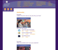
Enlightened use of multimedia. Web pioneers are finding ways to leverage audio, video, and 3D with finesse. Audio/Video applications, such as Real Networks' Helix Producer, which sells for about $399, and Microsoft Windows Media, which is free for Windows users, are being used to broadcast meetings and product introductions. The British Columbia Association of Optometrists, www.optometrists.bc.ca, offers educational videos for download.
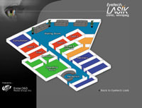
Meanwhile, 3D software like Apple's Quicktime VR, priced at about $338, and hardware/software solutions from IPIX, starting at $595, are being used to create product and service-related virtual reality experiences. Eyetech Lasik, www.eyetechlasik.com, offers a 360-degree virtual tour of its facility.
|
|
|
|
Eyetech Lasik offers a 360-degree, virtual reality tour of its facility online |
|
Quicksilver downloadability. Sometimes, less really is more. While many Websites seem to feature every technological bell and whistle known to man, savvier Web designers strip the bloat out of Web multimedia, resulting in quick downloads so visitors don't click away in frustration. Some companies even offer text-only versions of their Websites for visitors with low-power modems.
Also be sure that you have a high- powered Website host. "Your Web-hosting company should have at least a T1 connection," says Peter Kent, author of Internet Marketing and Promotions. "You don't want a Web-hosting company a with, for instance, an ISDN connection, that's simply too slow."
|
|
|
|
The British Columbia Association of Optometrists' functional site design |
Web promotion features. After putting together a killer site, it makes sense to find ways to increase traffic. One approach, by Craig H. Witte, OD, www.optometrists.org, is to offer a selection of links, which intertwine your site with eyecare communities.
Once you're fully engaged in Web design, you'll come up with ideas of your own about what works. One of the most inspiring qualities of the Web is its evolution, making business easier, faster, and more profitable.
Joe Dysart is an Internet speaker and business consultant based in Thousand Oaks, Calif. For additional information, contact 805-379-3673; e-mail: joe@joedysart.com; or visit his Website at www.joedysart.com.


