Design Tips
Retailers need an edge in today's competitive marketplace. One of the most important--yet often forgotten--retailing basics is visual merchandising. Here, 10 pointers for success
By Erinn Morgan
|
|
|
|
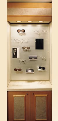
At Roosevelt Vision Source in Seattle, a cabinet with a metal mesh back panel with magnetic displays |
|
It can draw customers in to your dispensary. It can create shopping excitement that will lead to purchases. It can simplify matters for consumers who are constantly bombarded with conflicting retail messages. And it can give your dispensary an edge against the competition.
Proper visual merchandising is key to your success as a retailer. Yet it is often passed off as an unimportant aspect of the dispensary. "Visual merchandising is something that is often overlooked," confirms Dan Sloan, designer, Fashion Optical Displays. "It can interest customers in purchasing and can also create second-pair sales."
To help you in the quest for a better customer environment, increased sales, and repeat business, we have pulled together a list of the top 10 tips for successful visual merchandising.
1. KNOW WHO YOU WANT TO BE
This is first and foremost in the design process. "You've got to know who you want to be to your customer and create an environment that supports and plays into that--then you have to carry it out," says Steve Kaufman, editor of VM+SD (Visual Merchandising and Store Design magazine).
Dispensers who try to think like a retailer in this regard could see a marked improvement in business. "Visual merchandising is how you see it as part of the overall retail strategy to do what you need to do to accomplish," says Kaufman. "So many people think it is decorative or just pretty, but it is part of the whole retail process. In addition to advertising and marketing, visual merchandising needs to be a part of the equation."
Without a strong identity created through merchandising, customers may not have enough of a reason to come into your dispensary.
"If the customer is looking for a brand and many stores have it, there has to be a reason for them to be there--if you don't have a strong identity, it may be because they got a good parking spot or they had a coupon," Kaufman notes. "Smarter retailers create an environment that is specific to them so customers know which store they are in."
|
|
|
|
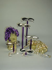
Individual pedestals lift eyewear and show frames off in an eye-catching
manner |
2. CREATE PROPRIETARY SIGNAGE AND GRAPHICS
One of the easiest ways that optical professionals can form a strong identity is through making their own signage and graphics. "Most retailers tend to depend on the graphics that are supplied by their brands," says Kaufman. "But these are usually very brand-specific, so they are intended to sell that brand. I don't know if they really serve the function of assisting the retailer. Many retailers give up too much real estate to their brands and their P.O.P., signage, and graphics."
Since people usually shop by brand or price, signage that clearly distinguishes the various choices in frame collections for the customer is critical. Graphics are also a key element to visual merchandising.
"They establish the environment and make the shopper feel good about their experience," he says. "Good graphics, which are images that portray the products, plant an idea in the customer's mind to feel good in the store with the merchandise and make them feel their life will be better for purchasing there."
|
|
|
|
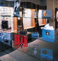
Storefront window of Pacific Eye Trends in Portland, Ore. |
|
3. DISPLAY WITH MOVEMENT
Movement is one of the most important elements in merchandising eyewear, according to Sandy Bright of Bright Displays, "Get some movement in the window displays or dispensary, such as a battery-operated display that rotates," she recommends.
"Movement, light, and color are so important to visual attraction. If you think about a TV or fireplace and how people get mesmerized by it--it's because of light, color, and movement."
Window displays are the first contact customers have with your shop and in addition to movement, color can be a big draw. "My customers are telling me they are having success merchandising with neon and gem colors right now," says Bright."
4. CREATE A PLACE TO MERCHANDISE VISUALLY
If there are no focal points for visual merchandising throughout the dispensary, the entire space may appear jumbled or, worse yet, overwhelming to customers.
Creating special areas--such as windows or shelves--to display products, P.O.P., and props (such as seasonal items or themed artwork) is a tenet of proper visual merchandising.
"You can't just throw it anywhere--it has to make sense," says Justine Kish, interior designer with Ennco Displays. "The windows are the number-one place. Glass shelves inside are also excellent." The main thing with focal areas for display is that it needs to look updated and fresh all the time. Many designers recommend utilizing reasonably priced seasonal display items as well as props purchased from other stores.
|
|
|
|
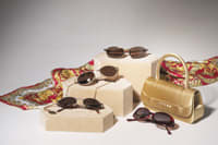
Using quality props and stands keeps your displays looking
attractive and enhances the value of the frames on show |
5. KEEP A BALANCE
As in many aspects in life, balance is of utmost importance in a display. "You want to distribute the weight of what you are doing evenly in the dispensary," says Fashion Optical Displays' Sloan. "You want the balance to fall evenly between left and right. You want to divide it vertically as well as horizontally."
Dispensers can make the bottom of their frame boards a bit heavier with more product to give the base more weight. "This creates the impression of stability," Sloan says.
Color also plays a role in balance. Grouping by color, from light at the top of boards to dark at the bottom, will divide the space and create the proper weighting.
6. CUT THROUGH CLUTTER
"Clutter is the number-one problem in the dispensary," says Margo Kolesar, business manager at Eye Designs Optometry, an optometric practice with three locations in the Sacramento area. "We try to keep the frame as the focal point and not the P.O.P. or clutter behind it."
Visual design experts recommend keeping a cap on the manufacturer-supplied P.O.P. that you use. Choose the point-of-purchase that is right for your dispensary and keep your look simple.
"The worst thing retailers can do is to create confusion and clutter," says VM+SD's Kaufman. "You will lose your customers. Even if they buy from you, it doesn't mean they will leave with a good feeling and come back. It can be very confusing to the customer with all the different brand P.O.P."
7. INVEST IN QUALITY
Using quality props and displays for your merchandise will only pay off in the end. "Don't get cheap because it will devalue your frames," says Bright. "If they are on cheap, beat up old stands, it will devalue the frames. Nice props and stands are going to help enhance the value of what you are showing."
|
|
|
|
Good lighting shows off frames without casting distorting shadows |
|
8. RAISE IT UP
To make a spectacle of your frames, lift them up higher on your shelves and display cases. "Put your eyewear on a pedestal," says Bright. "Individual pedestals make creative displays easy and fun."
Color can help here, too--use black to add drama, neon and gem colors for a playful display or kids' collection, or wood pedestals for a natural, earthy look.
9. LIGHT IT RIGHT
Like quality props, good lighting can only up the perceived value of your products. "Halogen light is important," says Bright. "I go out and see people with spotlights and shadows, and the lighting is a mess. Really take a hard look at your lighting. Look at your frames and see if they have proper, attractive lighting on them."
While many dispensaries use track lighting, Bright mentions that this is often not the best choice as it can cast unattractive shadows. In addition, dispensers should also take a look at the lighting in their showcases. "The main thing is to think about how the light is hitting the frames," she notes. "If the frame isn't angled back a bit, it is really hard to see."
10. BE AWARE OF DISPLAY ETIQUETTE
There are a few simple rules to avoid any turmoil in the office when it comes to visual merchandising. According to Margaret Furman, vice president of marketing with Magic Design, co-workers should ask each other if they want to change something in the dispensary or windows if more than one person is working on the displays.
She also suggests allowing customers to shop from your displays--meaning that the area may require a cleanup after each person visits that section.
Another point is that treasured possessions should be left at home and not used in visual displays. Finally, Furman says, "Merchandise your budget frames and insurance frames with the same care and cleanliness as your designer lines." Doing so will show a respect and appreciation for all of your products--a unified front is the best one.


