LOOKING BACK:
25 Years of Store Decor
The bold and the beautiful trends from the last quarter century
By Erinn Morgan
The beautiful thing about a look at the past is that it can bring the present into supremely sharp focus. Peeking back at the past 25 years in dispensary design helps us define the leaps and bounds the optical industry has made.
BIG CHANGES
How does store design and display differ today from 25 years ago? Industry design experts agree that the biggest change since 1986 has been that ECPs have moved their focus from dispensing in a medical environment to selling in a retail environment.
“Back in the old days, ECPs were worried about what colleagues and patients would think of them if their office appeared ‘too commercial,'” says Barbara Wright, president of Barbara Wright Design. “Offices typically had orange shag carpeting, ugly fake wood paneling, and frames hung on fishing line or strewn on narrow shelves like that classic Norman Rockwell optometrist. Who even knew what display lighting was?”
The fierce competition that arose in optical retailing in the '80s and '90s in the form of big box and discount retailers inspired independent and small-chain ECPs to step decor up.
Today, in-store design paints a wildly different picture. “ECPs are looking for the “wow!” factor—their own unique look and feel that puts patients in a buying mood and creates a beyond-ordinary patient experience,” says Wright.
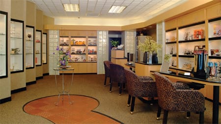
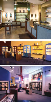
Store decor has become an art and a science. Images shown courtesy of Barbara Wright Design
A distinctive component of the more retail-focused dispensaries over the last quarter century has been the use of vibrant colors. While the color palette expanded to mauve-and-gray combinations and pastels in the bold '80s, it opened up even more in the '90s and 2000s.
“There has been an evolution from the ‘clinical' office environment to a more retail-oriented environment utilizing more earth tones in cabinet designs, wall colors, specialty lighting, and furniture,” says Cy Furman, president of Magic Design.
Frame display has also seen major changes over the past 25 years, moving from an afterthought to the main event in many cases. “When I began designing offices in 1984, many optometrists had frames as a convenience to their patients, but they were limited in number and often stored in drawers and trays rather than on actual displays,” says Lori Estrada, co-owner and designer with Fashion Optical Displays.
It wasn't until large chain stores started popping up in the 1980s and promoting their ability to make glasses in about an hour that ECPs started stepping up to the merchandising plate.
“In an effort to compete with that, independent ODs were remodeling their dispensaries and carrying a larger selection of frames, which were being presented in a much more ‘retail' environment,” adds Estrada.
Today, the retail environment is still evolving to include more merchandising plus branding and profit centers, such as dedicated sections for sunglasses or accessories, she says.
A focus on display also put the onus on lighting in the dispensary. “Lighting is now an essential element to store design, but it was not in the past,” says Richard Winig, president of Eye Designs. “Eyecare professionals are seeking quality, eco-friendly, and energy-efficient lighting that best displays eyewear by reflecting the right colors and textures.”

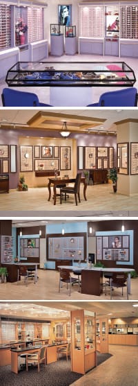
Eyewear dispensing has gone from a modified medical office to a more style-savvy setting. Lighting, furnishing, and color choices have changed over the years, reflecting the shift of optical dispensing from strictly medical to a more retail-driven focus. Images from current and vintage projects above courtesy of Fashion Optical Displays
KEY DESIGN TRENDS
The past 25 years have laid claim to some game-changing (and cringe-worthy) in-store design and display trends. Here's a look at each decade in the optical industry.
1980s DESIGN: The wild and bold “me” decade encouraged ECPs to bring store design out of the closet, but it wasn't always pretty. “The '80s seemed to be all about big furniture, white plastic fixtures, plastic pegs with white plastic backgrounds, and temple holes,” says Jan Ennis, president of Ennco Display Systems. And don't forget about the neon lighting.
“Pastel colors, especially the mauve and gray palette, were utilized and track lighting was the standard,” says Furman, who also notes that chairs were made of metal frames and solid, color-coordinated pastel colors.
1990s DESIGN: This decade ushered in ECPs' comfort level with retailing, and “retail” was no longer a dirty word. “Some even opened practices in malls going head to head with Lenscrafters and other national chains,” says Wright. In store design, glass block and vibrant colors were popular, especially in Southern California.
Lighting also came into focus with decorative lighting such as sconces, pendants, and chandeliers becoming high-demand items due to the influence of the coffeehouse culture trend, according to Furman.
The '90s also saw innovation in the fixture and dispensing table arena. “All the industry suppliers were beginning to incorporate shapes into workstations and multiple colors/shapes into the overall fixtures,” says Ennis. Colored laminates, such as mauve, gray, and seafoam green, were also in vogue.
“Doctors wanted their optical to look different, so using various color combinations allowed us to create more individual looks,” says Estrada, who adds that displays also started changing at this time, with the addition of showcases with glass shelving for creating specialty displays.

Displays have been updated with improved lighting and up-to-date color palettes. Shown: Projects from the past by Magic Design

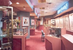
Neon lighting and mauve color schemes were strong looks from the 1980s that have aged with mixed results. Store design 25 years ago tended to boast a profusion of product and elements. Shown: Optical interiors from the past by Eye Designs
“The number of designer brands started increasing, and so did the need for signage and graphics in order to set them apart from the average frames,” Estrada adds.
2000s to PRESENT DESIGN: While the typical wall-to-wall display fixture look still prevails, savvy ECPs look to more personalized and eco-conscious design as a competitive edge.
From 2000 to today, “lean fixturing” has also been a the focus in the dispensary—in sharp contrast to the big and bold fixturing of the past few decades.
“There is just enough door and drawer space to fulfill some storage requirements and then much more emphasis on panels and lighting options,” says Ennis.
This decade brought the trend in finishes back to earth tones, but with a whole new approach.
“It has been mostly wood finishes and laminates with lots of various marble and granite patterns,” says Estrada. “Now each office wants to create its own look, so the design trends are wide and varied, unlike the cookie-cutter offices of the past.” EB
MILESTONES
Twenty-Five Years
Recognizing Excellence in the Optical Lab Business
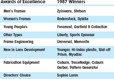
The Optical Laboratories Association (OLA) is celebrating the 25th anniversary of the prestigious Awards of Excellence. Established in 1987, the Oscar-like Awards recognize the products that demonstrate excellence in the optical lab industry.
“This year's silver anniversary is not about celebrating a single year of great products; it's about celebrating 25 years of products that have helped to shape the optical business as we know it,” says Jonathan Jacobs, OLA President.
In 1987 when the Awards were first given out, only seven categories existed: Men's Frames, Women's Frames, Young People's, Other Types, Frame Engineering, New in Lens Development, and Fabrication Equipment. Twenty-five years later, the number of categories has doubled to 14. Awards will be given in the following categories: Dress Frames, Specialty Frames, Children's Frames, Lens Design, Lens Materials, Lens Treatments, Marketing, Software Tools, Surfacing Equipment, Surfacing Material & Tools, Lens Treatment Equipment, Finishing Equipment, Finishing Material & Tools, and Accessories.
“It's interesting to look back at the change in categories as the optical industry has evolved,” adds Jacobs. “The number and types of categories that we have today represent the level of sophistication of materials, equipment, and processes in the marketplace.”
Winners of the 2011 OLA Awards of Excellence will be announced at THE OLA 2011 Annual Meeting to be held in conjunction with education and exhibits at International Vision Expo West in Las Vegas. An evening reception will be held in the OLA Lounge within the exhibit hall at Vision Expo West on Friday, September 23.

TOLL-FREE: 800-477-5652 ● WWW.OLA-LABS.ORG
| The Good |
|---|
| Design industry experts dish on the most outstanding, the most unusual, and the truly outrageous optical design trends from the past 25 years. Goodbye Clinical: “The use of a variety of colors and materials has created very upscale environment for ECPs,” says Magic Design's Cy Furman. In addition, modern options for displaying frames has been a boon to independents' business. “One of the best trends of the past 25 years has been the evolution of the merchandising system away from the static Lucite rod system to versatile frame board display units,” says Richard Winig, president of Eye Designs. Options Galore: “There are so many beautiful materials and finishes available right now in laminates, solid surfacing, flooring, lighting, etcetera, that it is a very exciting time to be custom designing offices,” says Lori Estrada of Fashion Optical Display. Transitional Style. “This is right in the middle between heavy traditional and ultra modern,” says Barbara Wright, president of Barbara Wright Design. “This eclectic look combines modern elements such as up-lit floating acoustic panels with classic touches like crown molding. It has universal appeal and looks stylish for many years, even decades.” |
| & The Bad |
|---|
| Neon: The '80s and '90s saw the prolific use of neon lights throughout optical stores. “It was above cabinets, on walls, and in logo signage—the brighter the better!” says Cy Furman, president of Magic Design. Adds Jan Ennis, president of Ennco Display Systems, “Neon was hideous. Ok, we took part in it and we apologize.” Plastic Displays: “Cream colored plastic vacuum-formed displays that yellowed over time were likely the worst trend of the past 25 years,” says Ennis. “They attracted dust and nobody knew that they would change color over time. We did NOT participate in this trend!” Oak Furniture: The overabundance of this wood used for furniture and displays made offices with this look appear dated after a few years. “It was so overdone,” says Ennis. “Now you hardly get oak laminate since it's so out of style.” Gaudy Color: “I am still surprised when I see pictures of displays that are green and purple or mauve and gray, which were popular combinations two decades ago,” says Lori Estrada, co-owner and designer with Fashion Optical Display. “There were also some popular displays made with a shiny gold material called Tambour, which now seems so gaudy, but back then it was state-of-the-art.” |
| DESIGN DIRECTIONS |
|---|
| Today's overall retail landscape is incredibly different than it was 25 years ago. Store design has followed suit to fill changing needs. To get a bird's-eye view of the most impactful changes, Eyecare Business checked in with the 25-year retail design veteran Brian Shafley, president of the design giant Chute Gerdeman. Q: How does store design and display differ today from 25 years ago in 1986? A: A big trend has been in how much branding takes place in stores. A long time ago department stores were all about the name of the store and brands played a subliminal, supporting role. At some point during the past 25 years, brands became very powerful and we saw shops in shops and branded statements within the stores. Then that got out of hand and stores decided to take the store back and they pulled back from brands. Also, store design used to be more done by architects and store planners and today it's done by brand designers and people who understand the bigger, marketing picture. The end result is that stores today are much more experience-rich environments. Q: What were the key retail and design trends in the '80s and '90s? A: The '80s were the advent of category killers, discount stores, and strip malls. These stores were all about ‘Let's put everything out on big shelves in bigger and bigger stores.' From a store design standpoint everything was plastic and big just like people's hair. It was kind of outrageous. The '90s saw a movement toward entertainment in retail, bringing in more of an experience. Q: What are the standout retail and design trends of today? A: As we move closer to the present time, there is some escapism involved. Whole Foods wants you to come and get lost in their store. Take a cooking class or sample stuff you've never tried before. The Apple store is also the poster child of the new millennium. They have in-store classes, and encourage you to come in and stay as long as you want—it becomes a social event. They feature simple graphics and lifestyle branding. Another huge retail and design trend happening right now is bringing in a local feel to stores. This is the generational pushback to everything being big chains. Even Starbucks is creating a local look to their stores. Macy's is doing a huge merchandise rationalization program using technology to tailor its merchandise mix to the local store level. Q: What are some simple ways independent retailers can get a modern store design look without spending a lot in today's economy? A: When selling something like eyewear, you've got to be in that fashion realm. A simple update is to get a new logo or updated signage and in-store graphics. Work with a local graphic designer who has retail experience. This an affordable investment compared with remodeling your store. Also, mannequins are making a huge comeback. They are so much more individualized now and not a huge investment. |


