Emerald City
A look at the biggest color trends for spring
By Alicia Hoglund
Bold, regal, and timeless are just a few of the words that come to mind when one thinks of the color emerald. Recently crowned the Pantone Color Institute’s 2013 Color of theYear, emerald leads the pack of this spring’s new palette, breathing new life into the new year and laying the ground work for an exciting and highly anticipated change of season.
Here, we look at the hottest hues for spring and explore the inspirations behind them.

Designers are incorporating emerald green into their latest collections. Shown, a dress sketch from Barbara Tfank
FINDING BALANCE
Every year, the Pantone Color Institute releases a report outlining the top color trends for the spring season, which tells a tale of consumers’ attitudes on the economy, fashion, and life via color. And this year’s palette is no exception.
According to the 2013 Pantone color report, the main story arc for this year is all about finding balance.
“The whole theme of the palette is about self expression, balance, and the need to re-energize,” says Leatrice Eiseman, color expert and executive director of the Pantone Color Institute. “Bearing that in mind, we chose colors that were representative of those feelings.”
Pantone’s spring palette features bright, attention-grabbing hues mixed with complementary neutrals to create a harmonious balance of practicality and versatility, liveliness and relaxation, all while providing endless opportunities for self-expression.
| So Inspired! |
|---|
Designers dish on the inspirations behind their spring collections. Peter Som Ella Moss Charlotte Ronson Carmen Marc Valvo David Meister Nanette Lepore Barbara Tfank |
A quintessential spring hue, green takes center stage in 2013. “We felt very strongly about green because we hadn’t done it in a long time,” says Eiseman, who, along with a team of experts, studied the trends to create this year’s palette. “We felt it was time to re-energize the palette, and green was a great representative color to show that balance.”
Enter emerald and other shades of green.With its rich, radiant tone, emerald demands attention but also creates a calming, grounding foundation for the palette. Playing off of spring’s natural surroundings, the bright yellow hue, tender shoots, emulates the first signs of season, and grayed jade, one of the season’s new neutrals, sets the stage for rest and relaxation.
The palette also includes monaco blue, a classic,All-American dark blue which provides stability and depth, and dusk blue, a muted hue, to quench a thirst for calm serenity. Linen, a warm off-white, acts as the trademark neutral and seasonal staple.
Rounding out the palette are a few showstoppers to add excitement and energy to the mix. The eye-catching poppy red, tangy nectarine, and cheerful lemon zest pack a playful punch, while African violet, a beautiful purple, adds an element of intrigue to the bunch.

Above, Pantone Color Institute’s Spring Color Palette; right, a sketch from the BCBG spring women’s collection
THOUGHTFUL COLORWAYS
In terms of wearability, this pitch-perfect palette delivers infinite ways for consumers to express their mood, find balance in chaos, and reinvigorate their wardrobe.
“There are so many great colors in the palette that can be used together,” says Eiseman, who explains that designers are now stacking the deck, pairing multiple bold hues with bold prints, too. “We’re seeing bold prints with the color of the year, as a well as the other colors.”
| Seeing Green |
|---|

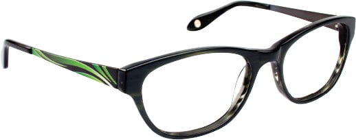
Dubbed the 2013 Color of the Year, Pantone reps note that green has been on the rise for several seasons, especially in the fashion and couture markets, and even on the red carpet. Leading this year’s palette, emerald answers consumers’ need for balance and harmony. What’s more, the easy-to-wear hue is a natural choice for today’s latest eyewear looks. Notes Pantone, “Equally harmonious on the cosmetic color wheel, emerald dramatizes all eye colors as it beautifully enhances green eyes, is compatible to blue eyes, emphasizes the green undertone in hazel eyes, and intensifies brown eyes to make them appear deeper. Emerald is also a perfect complement to peaches, pinks, roses, ruby reds, and aubergines—offering a variety of lipstick and blush options.” From hints of emerald accents to allover color, the optical industry is embracing the shade, making the most of its popularity, and bringing high style at a variety of price points. 


(Top to bottom) BCBGMAXAZRIA style Skylar by ClearVision Optical; Alexander McQueen style AMQ 4211/S by Safilo; Chloé style CE612S by Marchon; Dolce & Gabbana style DG2118P by Luxottica; Plume Paris style Taden by Best Image Optical; Quiksilver style KO3361 by A&A Optical; FYSH UK style F-3483 from WestGroupe |
A perfect example, says Eiseman, is a dress from the Nicole Miller spring collection. “If you said to somebody, ‘I’m going to use all of these colors together,’ you might think…What? But seeing them together, it’s great.”
The report suggests a multitude of yin-and-yang combinations like dusk blue with nectarine or poppy red with linen. For the adventurous, Eiseman suggests bold combos such as monaco blue with emerald or African violet with poppy red. Also, mixing neutrals such as linen with dusk blue, or the palette’s three greens is harmonious.

Above left, Nicole Miller perfectly blends bold color with bold pattern; above right, Charlotte Ronson mixes greens and blues
EYEWEAR TRANSLATION
While consumers may be a little bit more careful with color in their clothing, when it comes to accessories, says Eiseman, all bets are off.
“Accessories are a perfect way to take advantage of color,” she says. “Consumers know there is a vast array of color to choose from, and they want that.”
Eyewear, like other fashion accessories, is an easy and affordable way for consumers to update their look and re-energize their wardrobe for the coming season. “If they buy a nude-colored dress, they are going to want a bold color to help balance the neutrals and add interest to wardrobe with accent color.” EB


