The Many Moods of Fall
A look at the bold and beautiful colors taking center stage this season
By Alicia Hoglund
Fall is upon us, and with it comes a mix of emotions. We welcome the cool, crisp weather, providing a needed reprieve from the scorching temperatures. However, fall also marks the wane of summer, the last hurrah before a long, cold winter.
These changing moods are the inspiration behind Pantone Color Institute’s Fall 2013 Color Report. A grown-up, more refined version of its predecessor, this year’s palette, which features a blend of lively reds and pinks, deep blues, purples, and greens, offers a mix of hues as varied as the moods it helps to express.

Sketches from Nicole Miller (l) and Pamella Roland (r). Courtesy of Pantone
PLAYFUL PALETTE
“As the leaves change, there are all kinds of nuances in between the colors they generally change to,” says Leatrice Eiseman, executive director of the Pantone Color Institute. “From green to yellow to red, you also get a fuchsia tone. And that’s being translated into the color palette, which, I think, makes for a beautiful seasonal palette and a sophisticated way of putting together the colors.”
Green once again takes a commanding role, led by Emerald. Pantone’s 2013 Color of the Year, Emerald provides unexpected feeling of luxury and elegance to the season.
Linden Green, a light, yellow-toned green, adds brightness, while deep lichen green, earthy and lush, is one of the season’s neutral tones.
In addition to Emerald, the palette features other jewel-tones which add sophistication and regal appeal. Mykonos Blue is both a bold statement maker and a meditative hue. Another cool shade, Acai, a deep purple, adds richness, depth, and mystery.

Taking a cue from the changing leaves, the palette heats up with three fiery shades. Samba a sultry red, is perfect for grabbing attention and adding drama. Vivacious, a deep fuchsia, is a lively and expressive hue, as its name implies. A quintessential autumnal hue, Koi, a burnt orange, offers spiciness and comfort as the cooler weather arrives.
Rounding out the palette are this season’s neutrals: Turbulence, a dark, charcoal gray, and Carafe, a deep brown. Great alternatives to black, these go-with-anything shades can be mixed and matched with the more expressive colors to create sophisticated combinations.
UNEXPECTED MIXES
Though the colors stand tall on their own, they can be taken to new heights when paired together.
“We’ve seen in the last few years different kinds of color combinations, but I think this fall really reached a point where it’s so elegantly done, the way an artist might do it. It just makes for the most beautiful complexity,” says Eiseman.
As an example, Eiseman touts the mixture of elegant Koi and sultry Samba. “Both express different kinds of feelings, and yet you’re putting them together in the same palette.”
Warm Reds
From Samba to Vivacious to Koi, these fiery hues add instant glamour.
Left, a sketch from Rachel Roy, courtesy of Pantone. Top to bottom: BCBGMAXAZRIA Petite Frame style Filomena by ClearVision Optical; GUESS? style 2385 by Viva Group International; Vivid Eyewear style 811; Marc by Marc Jacobs style MMJ562 by Safilo; Diane von Furstenberg style DVF825S by Marchon

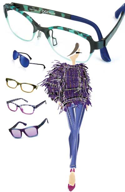
Cool Blues
Jewel tones like Acai and neutrals like deep Lichen Green add drama to the season’s hottest frames.
Top to bottom: OGI style 4806; Emporio Armani style 3019 by Luxottica; eyeOs eyewear style Harper; New Globe style L4052 by A&A Optical; Diesel style DL0071 by Marcolin. Right, a sketch from Nanette-Lepore, courtesy of Pantone

The palette offers limitless pairings depending on your mood. Mykonos Blue and Linden Green create a relaxed, classic look. Acai with Emerald or Samba make for attention-grabbing combinations. And neutrals Turbulence and Carafe are the perfect backdrops for their bolder counterparts.
This experimentation with color lends itself to accessories, including eyewear, says Eiseman.
“There’s so much more opportunity now for mixing colors,” says Eiseman. “The idea is to do things that are a little bit different, that you don’t always have to match your frames to what you’re wearing, which really limits you as far as your wardrobe is concerned. This is definitely a season of mix—not match.”
This concept of mix, not match, is a welcome idea, especially for consumers who are led by their wallets. New eyewear is an easy way to bring in on-trend colors and refresh your wardrobe without breaking the bank.
“In the last few years, people have learned that you don’t want to just discard; you want to hold on to what you have and be a little more clever with [it],” says Eiseman. “And that’s the fun of fashion.” EB


