FRAMEBUYER / COLOR REPORT
Calm, Cool, and Collected
The top 10 hues that will entice consumers—and drive sales—in 2016
BY KERRI ANN RAIMO

NICOLE MILLER:
“The city has inspired this collection—the real gritty street feeling and its contrast with nature in the city.”
(Featured Colors: Green Flash, Limpet Shell, Fiesta)
For the first time ever last December, Pantone granted two colors the Color of the Year title for 2016—Rose Quartz and Serenity.
This wasn’t a sign of excessiveness, but unity.
As Pantone looks to fashion for Spring 2016, the same emphasis on unity reigns supreme. Fashion designers focused on a palette that not only is notably unisex, but also unites both urban design colors and the hues of lush natural landscapes. This translates to looks that are both vibrant and tranquil—cool and calm.
“Colors this season transport us to a happier, sunnier place where we feel free to express a wittier version of our real selves,” says Leatrice Eiseman, executive director at the Pantone Color Institute.

Spring 2016’s Top Hues for Fashion
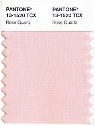
ROSE QUARTZ
Prominent in its conveying of gentle compassion, Rose Quartz leads the pack by highlighting not only nature (flower and mineral), but also elegance—rose and quartz.
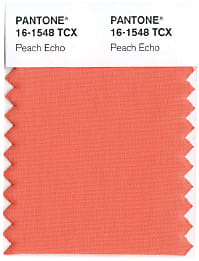
PEACH ECHO
Orange has been popping up in fashion communities for several seasons, and this spring’s orange hue is a juicy and playful one.

LILAC GRAY
Every season needs its neutrals. Lilac Gray epitomizes the dichotomy of natural and urban occurring this season.
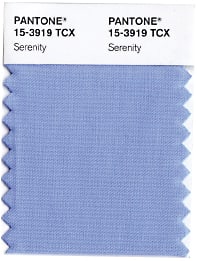
SERENITY
This tranquil shade pairs well with the bolder top colors this season, as fashion designers paired it with shades like bright Buttercup and Fiesta.
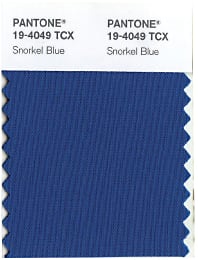
SNORKEL BLUE
A navy hue that’s more playful than authoritative. The name serves as an ode to getaways—highlighting the escapist and transportive qualities of this spring’s shades.

FIESTA
Evoking the feel of fiery celebration, this yellow-based red hue still plays and pairs well with the quieter hues at the party.

ICED COFFEE
Pantone designates this as a color that works well to transition through seasons. Iced Coffee is a neutral hue that’s earthy and strong.
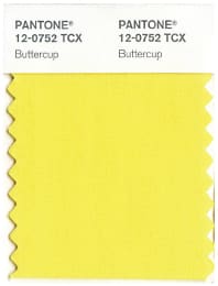
BUTTERCUP
A bold yellow that top designers paired with both the season’s neutrals like Lilac Gray and other energetic shades such as Snorkel Blue.
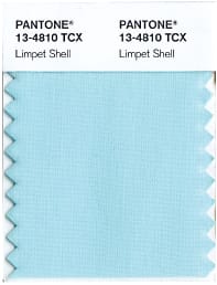
LIMPET SHELL
Defined by Pantone as clear, clean, and defined, Limpet Shell is a shade of aqua that’s a breath of fresh air.
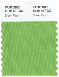
GREEN FLASH
Too green to be true. An intense hue that still leans on nature.

REBECCA MINKOFF:
“I was inspired by the youthful spirit of London in the ‘60s, particularly Marianne Faithfull’s style—that sort of reluctant rock royalty.”
(Featured Colors: Peach Echo, Rose Quartz, Lilac Gray)
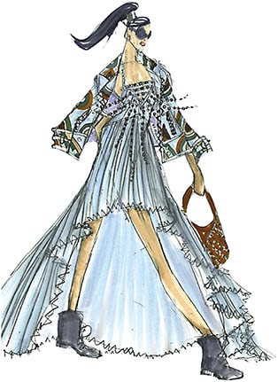
EMILIO SOSA:
“Our colors are inspired by an excursion to New York’s High Line green space, which is a perfect mix of urban architecture and lush greenery.”
(Featured Colors: Serenity, Iced Coffee, Limpet Shell)
Got Color?
5 DESIGNER TIPS FOR CHOOSING THE RIGHT SHADES FOR YOUR SPECS MIX

In an exclusive interview with Nicolas Roseillier, creative director at REM Eyewear, EB gets the goods on how to bring the right colors into your eyewear mix.
KNOW YOUR AUDIENCE
An eyewear color that sells well in one country may not sell well in another, and there are divides within nations as well. “Purple is a very big color in the U.S. market,” Roseillier says. “But if you go to France, for example, it is a color that does not sell…That’s something we’re starting to see more and more—developing collections and colors just for different markets.” Keep track of top sellers, and select hues accordingly.
NAVY IS THE NEW BLACK
Roseillier believes that blacks and browns for eyewear are falling by the wayside, saying, “I think we’re starting to see some navy that replaced the black beautifully. I think the very deep, rich burgundies are definitely replacing the browns.”
TONE IT DOWN
“It’s almost like when you’re facing the sun and then you get kind of blinded a little bit by it and you can’t see. It’s kind of like that white filter over it,” Roseillier says of Pantone’s top colors for Spring 2016. In other words, desaturation is in.
FOLLOW YOUR DNA
Roseillier keeps the “brand DNA” in mind when choosing colors for REM’s various brands. “Over the years we did find new colors and new textures,” Roseillier says of REM’s work for John Varvatos. “A year and a half ago, we launched this beautiful kind of navy blue with a brown texture on the bottom. Everyone was like, ‘Oh, really? For Varvatos?’ And it actually became our best-selling color. But it fits within the DNA of the brand, which is really what we’re looking at when we work with colors.”
FACE TIME
Roseillier says that shades like Rose Quartz, Peach Echo, and Serenity should be popular this season because they complement skin tones. “When I used to design with Derek Lam, back in New York, that’s one thing [we] used to talk about—having that rose [color] on the inside of the frame always was more flattering on the skin,” says Roseillier.


