The
Color of Spring
Clothing--and eyewear--for the
upcoming season takes on a decidedly softer tone
By Erinn Morgan
|
|
|
|
Romance is embraced for a healing Spring 2003 in fashion |
|
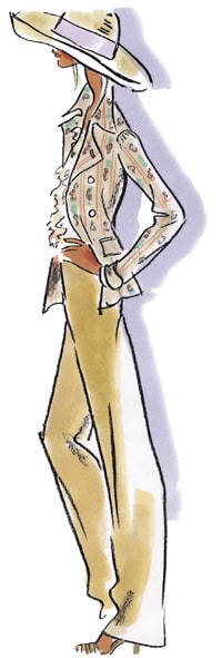
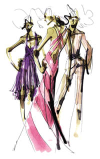
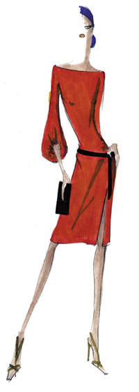
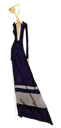
Fashion designers agreed upon a new direction in color for Spring 2003, and now eyewear is following suit. Eliminating excess and extravagance, they introduced a new purity in color that heralds a more positive, comforting, and healing time for our country. At the Spring 2003 runway shows in New York, American designers collectively presented a soft and soothing palette that had a dash of spice.
ROMANCE IS IN THE AIR
Styles sauntered down the catwalk in romantic, feminine fabrics such as luxurious satin, lace, and cashmere. The romance was intensified with a palette of shades that evoke a sense of beauty and nature. The most prevalent hues were delicate pastels, tried-and-true neutrals, and ayurvedic blues.
"This season is all about easy, comfortable glamour," said Lisa Herbert, executive vice president, Pantone Color Home and Fashion. (Pantone, Inc., developer of the globally accepted PANTONE Color Systems, is the leading source of traditional and electronic products for the selection and accurate communication of color.) "While the classics khaki, navy, and white anchored many of the collections, American designers sparked tried-and-true aesthetics with a message of freshness and wearability through uncomplicated color selections."
|
|
|
|
Color choices express a spirit of strength and energy |
Top hues (from the Pantone color charts) include pink champagne, café au lait, baby blue, lilac, peridot, acacia, twilight blue, aqua sky, and sugar coral. The color story here is not just about pastel prettiness; the range expresses a spirit of strength and energy. Tones like coral, peridot, and acacia add a flash of exuberance to this peaceful mix.
The true beauty of the season's color choices is that they allow women to make personal style statements. "It's truly a statement of confidence," Herbert continues. "This season's shades are not superfluous. They allow a woman's personality to shine through and afford her the option to express her interpretation of Spring 2003."
EYEWEAR FLAIR
Fashion-forward frames follow a similar color direction for Spring 2003. Updated pastels are strong, as well as warmer tones mixed with neutrals. "We will see a lot more pastels, but with the sweetness taken out," says Blake Kuwahara, designer of Kata Eyewear. "These pastels are much more modern. Berries, lilacs, ferns, and sky blues--warmer tones--are also important, especially when juxtaposed with camels and other neutral tones."
Kuwahara also notes that new color combinations in eyewear will be outstanding for spring. "We are doing a lot of those color combinations--ferns with blues, or taking avocado or sage green and mixing it with a lighter or more lime green."
|
|
|
|
Classics will remain in the color palette in clothing and eyewear |
|
Of course, the classic colors are still en vogue in eyewear, including black, tortoise, and variations of each. The important color trends will show up mainly on plastic frames, with some metals shining through as well. "Metals are thinner, and it is more difficult to show the colors," says Kuwahara. "Plastics have a translucence to them, and this is part of the color trend. This see-through feeling is very important. These colors are still possible on metal finishes--it will just show up as shiny silvers juxtaposing with the current colors."
Does eyewear follow the fashion color trends? Not always. But more often than not, the eyewear industry comes out with eyewear that matches and complements the clothing styles and hues of the season.
One factor that makes this possible is the timing of when each season's clothing trends are introduced. "To some extent, the industry follows fashion color trends," says Kuwahara. "Because our spring product is released in March, and the fashion for the same season is released six months earlier, we are able to follow the fashion trends."
He warns, however, that some apparel colors don't translate to eyeglasses. Even more, particular tones do not work against the skin or look good at eye level on the face. Chartreuse, orange, and yellow are prime examples of this problem. Thus, many eyewear designers strive to contrast and complement fashion colors in eyewear. "In general, most people aren't looking to match their pink dress with pink sunglasses," says Kuwahara. "The key is to create eyewear in colors that complement what is happening on the runway."
Look for a selection of eyewear this season that will work with the fashion-forward clothing styles your customers will crave. Being armed with the knowledge of the trends for each season--plus an arsenal of appropriately stylish eyewear--will help your dispensary stay ahead of the pack.
This spring, the buzzwords are soft pastels, beauty, romance, passion, and renewal--all terms that epitomize the upcoming season of rebirth.
|
designer's choice |
Color schemes on the drawing board for spring BCBG MAX AZRIA Colors: Chalk, lavender, lilac, citron, blush, sea mist. Signature colors: White and lilac. "We wanted to combine vibrant brights in an exciting way and to ground them with more neutral tones to create a striking dynamic." On color..."For our spring 2003 collection, we wanted an uplifting color palette, colors that would seem new and exciting, yet reminiscent of a specific time and place. The colors we fell in love with were inspired by Havana, Cuba, in the 1930's and 1940's." KENNETH COLE Colors: Vintage peach and lilac, flesh tones paired with somber wood hues, sun-bleached yellows, reds, coppers, and dull gold, orchids, pastels, and grays. Signature colors: Translucent colors with a wash over them; nothing too loud or vibrant. CAROLINA HERRERA Colors: Orange, bark, vanilla, sunflower, lilac, peridot, sapphire, black, and sand. Signature color: orange. On color..."The spring 2003 collection is sensual and exotic. It's all about 'sunny' colors." RALPH LAUREN Colors: soft pastels, washed greens, pinks, blues, and creams. MICHAEL KORS Colors: Shades of blue, aqua, and white. Signature color: Navy. Sharp, graphic, yet soothing. On color..."My collection is filled with shades of blue, aqua, and loads of white. Blue is so optimistic and sporty, reflecting the California attitude. I love white--it's so clean and refreshing." ANNA SUI Colors: Poppy red, turquoise blue, kelly green, golden yellow. Signature color: Poppy red for cheerfulness, freshness, looks, and spirit. |


